Case study
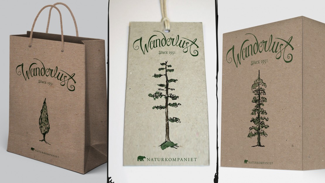
Assignment on the course at Berghs, Illustration, professional: Create a illustrative visual concept in my style for Naturkompaniets stores. Here I use this case to show what my process may look like.Gathering information, brainstorm & first sketches
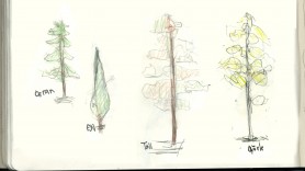 First off I gather information on the company – their current visual language and orientation, audience and goals.
With the gathered knowledge in mind I began to brainstorm and make some initial sketches. I ended up with an idea where different trees would play a big role in the final solution – trees to represent open landscapes, wildlife and freedom – the essences of the brand.
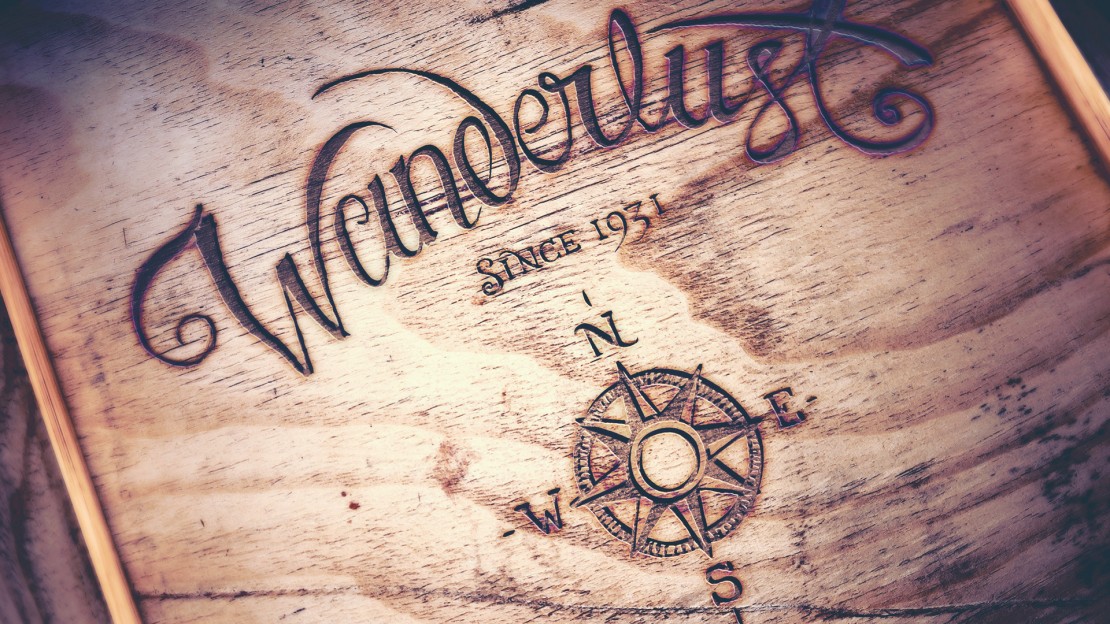
Since I am a lover of words and hand drawn letters I wanted to find a suitable word to illustrate the concept. Potential words as “Adventure” and “Into the wild” was finally summarized in the excellent word Wanderlust. As described in wikipedia: Wanderlust: a strong desire for or impulse to wander or travel and explore the world, to discover one’s very existence.
Moodboard & first feedback
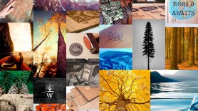 For this particular project I was to create a mood board to present the feeling I wanted to apply. I started by pinning images to a Pinterest board. When I had enough images I made a simple yet representative layout to visualize my thoughts.
I showed my ideas to the client and they were on board with my thoughts regarding images and feel as well as the word Wanderlust.
Lettering & final images
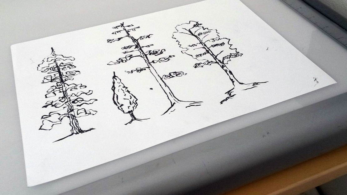
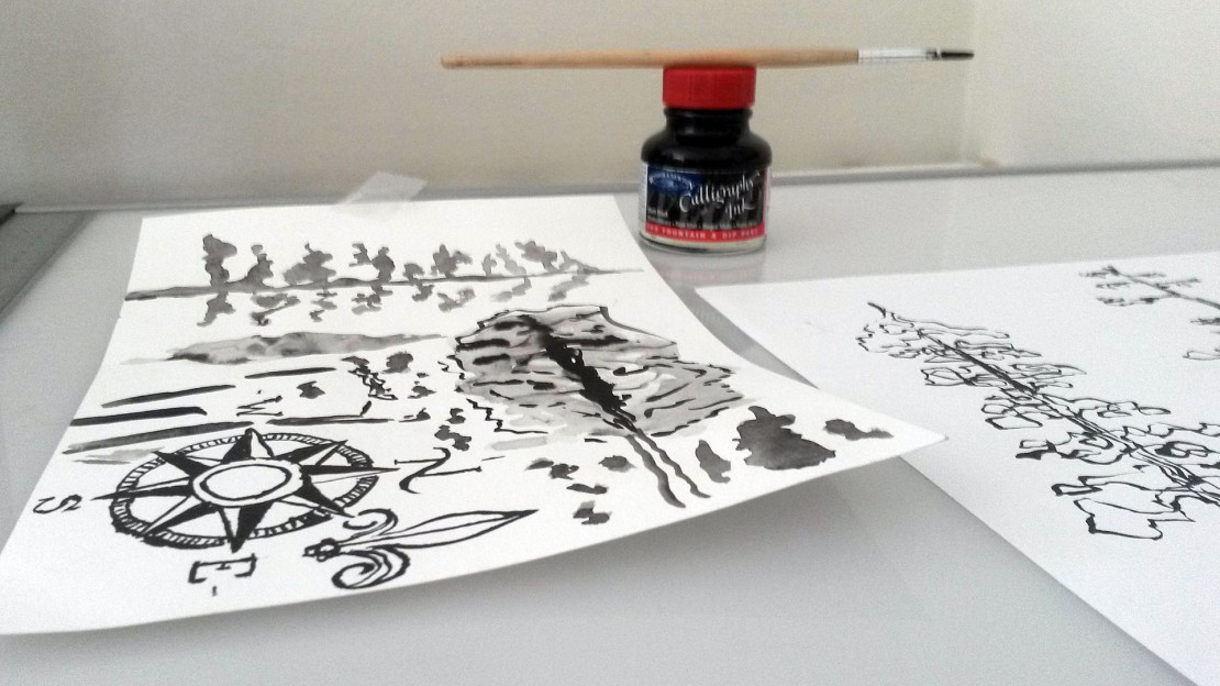
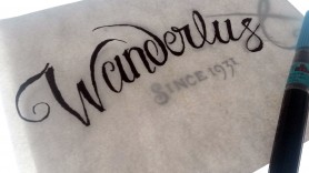 I tried several compositions for the word Wanderlust and ended up with one that I was particularly fond of. I sketched the word and the trees with a pencil. Final touches were added with ink, brush and brush pen.
Everything was scanned at a high resolution and later on retouched in Illustrator and PhotoShop.
